Why I ignored GreatSchools.org ratings
05 Nov 2018Parents in Seattle Public Schools have the opportunity to select which school they prefer for their children, through the School Choice program. This choice is the topic of constant conversations among parents. Over the past few years, my wife and I have had other parents ask us about our decision to send our kids to a school with “low ratings”, “(a bad) reputation”, and “equity issues.” When we dig into the root of all of those parents’ questions, we continue to find references to the de-facto default source on information on school quality: GreatSchools (By “de-facto default”, look at your results when you Google your local school’s name, or search for houses on Zillow or Redfin in your neighborhood. GreatSchools holds prominent positions in all three). From their site:
GreatSchools is the leading national nonprofit empowering parents to unlock educational opportunities for their children. We provide school information and parenting resources to help millions of American families choose the right school, support learning at home, and guide their children to great futures.
The idea that they help “choose the right school” is deeply flawed. While digging into the data, I see a reflection of class and race rather than school quality. It is a simplistic reflection of our broader societal issues, not a reflection of the ability for a school to teach our children. It’s flawed in its approach to the data, alarmist in its language, and dangerous in its power to further segregate schools.
Relying on aggregate test scores is a flawed approach
GreatSchools builds a composite score for elementary schools based on test scores, student progress, and equity. All three of those inputs are, at root, based on tests that are shown to have significant differences between socio-economic and racial categories. For the State of Washington, one illustration of the difference is 3rd grade proficiency:
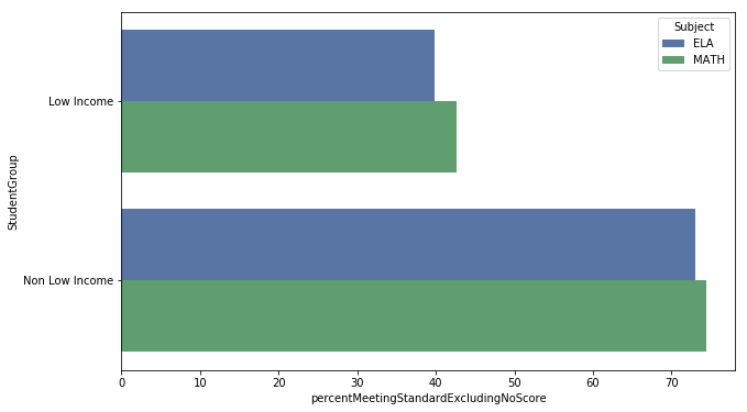
Low income students (poor kids) in 3rd grade are meeting standard 39% of the time, while those outside that categorization (rich kids) meet the standard 73% of the time. All things being equal, you are significantly more likely to pass the test if you’re not poor.
Hold that thought for a moment and let’s extend it to schools. If a hypothetical average Washington school was made up of 0% poor kids – it’d meet the standard for 73% of its kids; and, if a school was 100% poor, it’d pass 39%. That’s not saying a school is failing – that’d be average based on the demographics. A rich neighborhood (that rich people choose to attend), on average, will have higher test scores.
The use of alarmist language is misleading
In Northeast Seattle, we have a few different elementary schools to choose from. You can easily imagine a well-intentioned parent building a list and sorting them by their GreatSchools ranking. Something like this:
| School | GreatSchool Rating |
|---|---|
| Bryant Elementary | 9 |
| View Ridge Elementary | 9 |
| Decatur Elementary (Accelerated Learning) | 8 |
| Wedgwood Elementary | 8 |
| Laurelhurst Elementary | 6 |
| John Rogers Elementary | 5 |
| Sacajawea Elementary | 4 |
| Sand Point Elementary | 4 |
While building the list, the parent will likely pay attention to the language used. When they see that 9 on Bryant, they’ll see something to the affect of “Above Average”, but with Sacajawea, they’ll see “Below Average.”
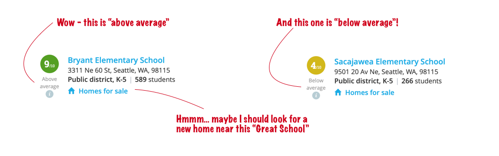
With language like that, what parent would want their kid to go to a below average school? You’d likely, instead, click the blue link for “Homes for sale”, and then be discouraged by housing prices.
If you dig deeper on GreatSchools, it gets even worse. In each school report, they have a section title “Equity Overview”, with the subtext “Successful schools are working to close the achievement gap.” I think this is a great thing to explore and target when proposing any school reform. We should set our expectations high when it comes to equity. And… there’s definitely some issues based on Sacajawea’s data – the rich kids are beating the state average and the poor kids are lagging. That said, schools that have no portion of their student body in low income groups get a pass. Bryant parents don’t see any information on low-income students, because, they have too few to even report.
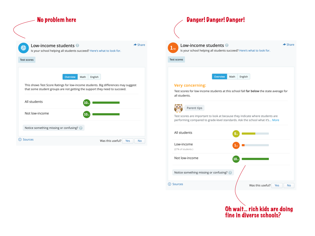
Look closely – both schools are getting 10/10 for the non low-income students. Is one school actually better than the other? Or are the demographics just different?
Looking at the actual data shows real equity gaps
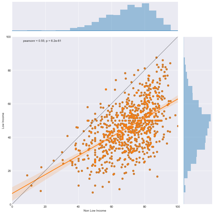
Across the entire state of Washington, schools have equity gaps. This is not unique to the low performing schools in the list above. The following is 3rd grade english scores for schools that report on low income groups vs non-low income groups. Each dot represents a school’s score for low income students and non-low income students. If we had complete equity, every school would be at that dashed 45 degree line. Any dot below the dotted line is a sign of poor kids underperforming their rich classmates at the same school.
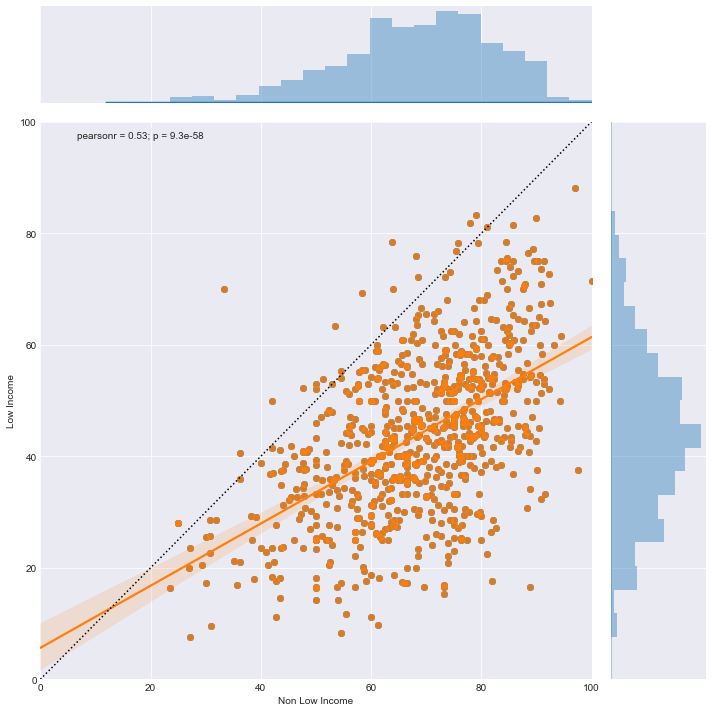
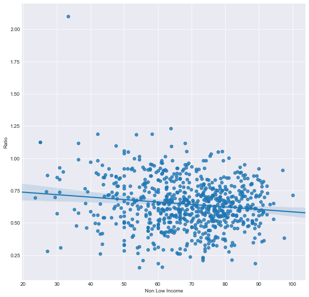
And, the same story for math:
Note the direction of the orange trend line. You’ll also find that the gap between the rich kids and poor kids actually grows the more successful a school is. At GreatSchools, they penalize you for having poor kids underperform (drags down the overall score) and penalize you for having rich kids beat the average (drags down equity). The only way a school is successful is if everyone succeeds, and that is much harder at a diverse school. In this chart, we plot % of achievement (low income scores / non-low income scores) on the y-axis and non-low income scores on the x-axis. The achievement rate gets smaller as the test scores get higher. The gap widens.
There is some good news in this chart – you’ll also see that there are schools that appear to be over-achieving for both income groups. My analysis pulled those dots out to see if we can learn from those schools that are closing the gap. But, I’ve found that it’s incredibly hard to find consistent patterns here over a 3 year period. If something is working, you’d think it’d stick, right?
However, less than 1% of low income cohorts were able to pass over 65% of their students consistently for the past 3 years (in contrast, over 23% of non-low income cohorts did.) And, even that 1% of schools didn’t consistently do well in the 5th grade tests. There just isn’t a strong pattern to great test scores in low income groups on a consistent basis. And, yet, GreatSchools uses these fluctuating test scores to underpin their recommendations.
Comparing schools with different demographics is reckless
GreatSchools over promises in their user interface. Imagine you are a parent who is zoned for Sacajawea – the big call to action at the top of the page is to “See the 3 nearest high performing schools”. And, they are all schools without a large block of low income students – it continues to use an aggregate number and ignores demographic differences:
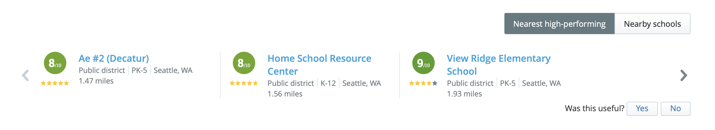
While Sacajawea’s student body is 27% low income, Decatur is only 8% low income (and is an accelerated learning school that requires acceptance), Home School Resource Center is not a school, and View Ridge has only 6% low income. So, they suggest you go to richer school or home school – just avoid the school with diversity and high mix of poor kids. And, to a large degree, that’s what many families do. They choose the simple and safe measure of high aggregate ratings, and ultimately lose an opportunity for their children to also learn through diversity.
Diversity beyond income
It’s also important to look at scores by race, since test scores show vastly different outcomes depending on race.
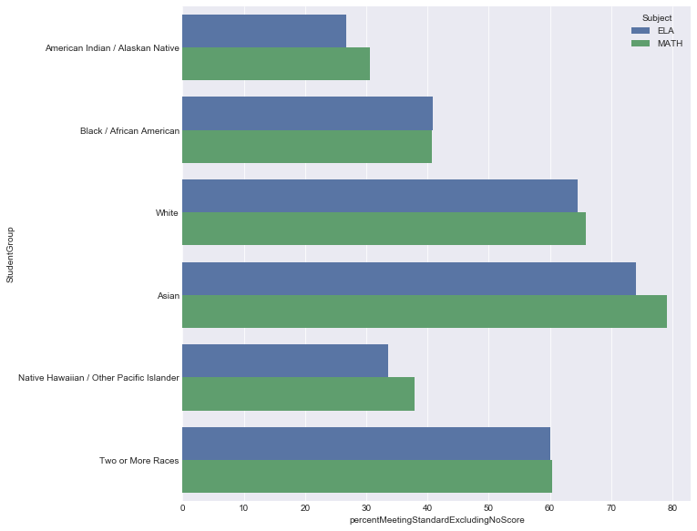
All things being equal, white kids are meeting standards in 3rd grade 1.6x more often than African American kids. This is where it gets more cloudy because we can’t drill into the scores at one level beyond (low income and white). We don’t see data for poor white kids vs poor black kids. Without that level of demographic detail, we’re (again) comparing things that can’t be compared, which is a reckless design pattern.
The dangerous power of a self-reinforcing loop
There is the potential for a self-reinforcing loop here. When parents take kids with means out of these poor schools, we take kids that are capable of passing the test out of their future dataset. Once a school is branded, it changes decision behavior – and, it’s hard to overcome that. You won’t attract the demographic contingent that, on average, will achieve high scores and advocate on behalf of the school. And, thus, you will have tests scores that reinforce underperformance locked into that branding forever. It’s a vicious cycle.
And - don’t get me wrong: I’m not saying that schools with poor kids can’t be great. I’m saying that having poor kids makes it much harder for a school to be in a top percentile for performance and achieve a high GreatSchools rating. Rich schools, on average, have it much easier. And, if you add on the layer of race, it clouds things further.
As parents, we need to be wary of GreatSchools as a data source. They may not be helping us find schools where our children will learn and thrive (that’s the whole promise of this, after all, isn’t it?). They may simply be helping us find ways to avoid integrating with kids that don’t have it as easy. And with that, we’re losing an opportunity to teach lessons beyond the test.
The source code and Jupyter Notebooks are available on my github, the data pulled was from GreatSchools.org and OSPI. I’m still just now really learning Python, Pandas, etc.; if you have tips to make my analysis / code better, please email me. I 💘 feedback.